Game-to-Player Communication
Warning: foul language.
You might have noticed a slowdown in the (frankly silly) pace of game updates. The reason for that is that I'm trying to overhaul a bunch of backend stuff. Rather than leave it at that, I thought maybe I should try to actually explain what's going on, as well as illustrate how it's led me down a path of feature whack-a-mole that's prevented me from actually posting any new builds.
Tooltips (In the Ancient Times)
(By which I mean, 'a week ago')

So I had tooltips before, but they were sort of kludged-together things held together by spit, duct tape, and hopes. Everything I added which affected tooltips meant a portion of my existing tooltip code suddenly broke and needed retooling. But I sort of grit my teeth and dealt with it because I didn't feel like diving into fixing them properly.
You may notice you're at the end of this section and I haven't fixed the tooltips yet. Well, I'm going through these things chronologically. We'll be coming back to tooltips soon, don't you worry.
The Book
<img src="https://img.itch.zone/aW1nLzEyODkzMTI3LnBuZw==/original/kVT7ne.png" style="float: right; padding: 10px; max-width: 400px>
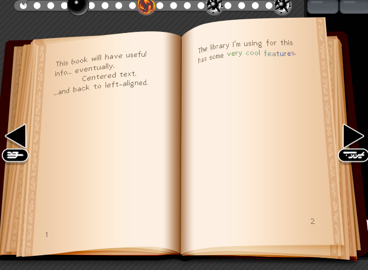
Rather than fixing the tooltips, I had this idea for an in-game manual that would at once work as a place I could put neat lore-like stuff as well as more technical information and hints. I pictured it being curved and looking 3d. This was a terrible idea. I did it anyway.
My initial attempts looked... pretty bad. The text wasn't curved, and the library I was trying to use to do some neato text styling stuff (shoutout to JujuAdams' Scribble library) doesn't have anything built-in for such curving.
I eventually hit upon the idea of using the library to draw to a surface, then applying that surface as a texture to a trianglefan primative tracing the curvature of the page. Aside from some false-starts due to font weirdness, it worked. And it looks great!
The only thing I had to do next was set up the 'regions' feature of the Scribble library so I could make clickable links within the book and...

Oh. Oh no.
So because I'm doing all this weird drawing-to-a-surface-to-a-texture-to-a-primative runaround, the regions feature just plain isn't going to work right. I suppose it might work in the vaguest sense of the word, and maybe I could do some real houdini shit with running the mouse's coordinates backwards through some math using the same vertex array I use to make the trianglefan primative and come out the other side actually able to use regions with this whole awful black-magic-fuckery anyway. And I may yet do that. But not today.
Today, I am happy to have the book working (without regions) and moving on to better things.
Tooltips (In the Modern Times)

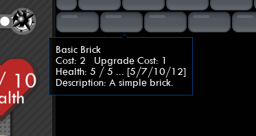
Having had a somewhat successful little trip with the Scribble library and feeling fairly confident, I return to the tooltips. I basically rebuilt them from the ground up using the lessons from both the first round with the tooltips and what I learned from Scribble. And since I'm not a (complete) madman, I made the text flat, so I could even use regions! And that meant recursive tooltips were possible!

I even built the system such that I didn't have to hard code these recursive tooltips. I just have a set tooltip for specific keywords, and if I mark something as a keyword in a tooltip's text, the code will magically do the hard work of making that into a recursive tooltip. And yes, I can have tooltips in my tooltips in my tooltips. That's what recursive means.
User Interface / Roguelite

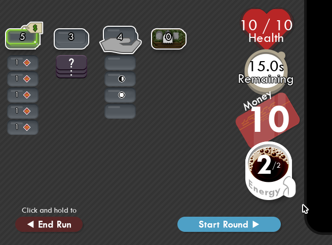
The extra-super-observant may have already noticed some new stuff lurking in the background of the images higher up in this devlog.
Yeah, so, I don't know if I intended this game to be a roguelite when I started out, but that's definitely the direction I want to take it. Think deckbuilder anti-Breakout and you're not far off what I'm trying to build.
The gameplay loop I'm intending is one where the player has a hand of bricks and an amount of energy they can use to add special bricks to the field or perform certain effects such as healing bricks, adding armor, or directly affecting the position/direction of the balls. Once they're out of energy, their turn ends and the balls are given free reign to wreak havoc for a short period of time. Then, the field pauses with the balls still in place and the player has an entirely new turn.
This would let me cut down the amount of time players have no control from 15s to perhaps even shorter than that... 10s or maybe 5s. I'll take some testing to figure out what the right amount of time is. As much as I enjoy sitting back and watching my handiwork, I also feel like time where the player has absolutely no control really shouldn't extend beyond a certain limit. The player needs to be able to react to things, even if its in a carefully planned manner. See Transistor for a great example of this kind of gameplay.
Diagetic Energy Bar (Coffee Mug)
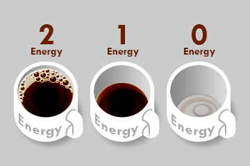
 Have I mentioned yet that I'm really damn proud of that energy UI element? It's diagetic. So even aside from telling you the number, it also changes in appearance to reflect how much energy you have using the amount of coffee in the cup.
Which isn't to say I think it's perfect - my biggest gripe at the moment is that the froth on the full-cup results in it having a very similar appearance to the half-cup image if you squint (or just have bad eyesight... a good friend of mine falls into this boat. As much as that sucks for them, I'm glad it's forcing me to try to be mindful of this sort of thing.)
Oh, and I guess if it wasn't obvious at this point, 100% of the art assets in this game are completely homemade. I've made everything. Well, except for some fonts, but I'm doing my best to stick to CC0 fonts, or ones I made myself. Big fan of the Twentieth Century font.
(Tooltips &) Cursors
 And we at last come to the thing I've most recently been working on, and the thing which prompted me to want to make a devlog about all this. Cursors.
With as busy as the UI is getting, it's starting to get even less obvious what you can and can't click, as well as what it does. And the tooltips were starting to get a bit irritating in that they'd just spawn into being when you're trying to mouseover something else, and then there's this tooltip in the way so you have to kinda maneuver your mouse away and back again trying not to trip over any mouseoverable things... it was becoming a mess.
Certainly, I could just change the tooltips to only appear if you right click those things which previous spawned them automatically... but how would you even know you could do that?

Luckily, this is an already solved problem. As such, I decided to take a feature from what I think is one of the icons of deckbuilders, Inscryption. I won't be going into that game terribly much here, but if you like deckbuilders and somehow still haven't played Inscryption. Do. So. And avoid spoilers like the plague. Inscryption is one of those games like Tunic or Outer Wilds where the less you know going in, the wilder and more fun the ride will be.
But I will say that the fact that you can mouseover any sigil on a card in Inscryption and your cursor changes to remind you that you can right click it to get more info is genius. (Even if half or more of people who play it and upload let's plays to youtube seem entirely blind to this cursor change.) It's the kind of genius that seems entirely obvious in hindsight, and yet you can look at plenty of games from before (and currently) that still don't do this.
So I'm taking that idea and stealing it. I've built up the same system which handles the tooltips to also change your cursor based upon a whole host of data. Can you left click this thing to do something? Does it have a tooltip? Does it cost some kind of resource? How much?
In Conclusion
I suppose the round-about conclusion to all this is... I've been working on it! I swear! It's just that the stuff I wanna do at the moment has required I follow a seemingly never-ending string of UI improvements in order to facilitate the system changes. As much as I'd love to get a new build out and maybe even get some feedback, I can't really do that when things are half-broken until I finish upgrading everything.
It feels like I can see the light at the end of the tunnel at this point, at least. I just gotta finish up the parts I've been working on, and update all the existing bricks to work properly under the new system. Then maybe I can get back to adding rediculous new bricks every other day.
Buildout
What if Breakout, but you were on the side of the bricks?
More posts
- Brick DesignJul 19, 2023
- Mostly backend stuffJul 17, 2023
- Pretty big update.Jul 15, 2023
- Build of Many ThingsJul 15, 2023
- Bugfix (Campaign Upgrade)Jul 13, 2023
- Minor Bugfix (Timer Brick)Jul 13, 2023
- Timer Brick, Bugfixes, BalancingJul 13, 2023
- Sandbox/Campaign Modes, Projector BrickJul 13, 2023
- Minor BugfixJul 12, 2023
Leave a comment
Log in with itch.io to leave a comment.